Revolutionizing Data Analysis with PandasGUI
PandasGUI unleashes unprecedented simple and efficient data analysis.
Effective data analysis is key for businesses in today’s data-driven world, and Pandas, a Python library for manipulating and cleaning data, has become an invaluable asset. Though not easy for beginners or those preferring more visual approaches to learn it quickly. But PandasGUI provides an incredible solution: an amazing library with graphical user interfaces to streamline data manipulation and visualization capabilities. This article will walk through installing it and show its remarkable features that can enhance data analysis capabilities.

Photo by Mateusz Butkiewicz on Unsplash
Getting Started with PandasGUI
To start using PandasGUI the first step is to download its package. You can do so by running the following command in the command line:
pip install pandasgui
Now you can load and import it using the following commands:
import pandas as pd
import pandasgui
If you are using other operating systems than Windows you might face some problems due to the absence of the environment variable APPDATA. If you are using Mac OS or Linux and tried to import PandasGUI you will get a similar error:
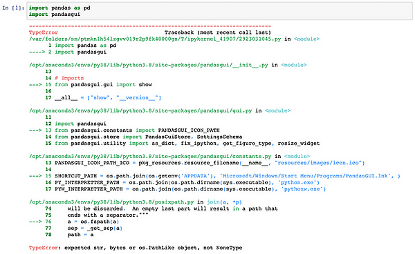
To address this problem, one simple workaround is to assign an empty string as the value for the environmental variable causing the error. By doing so, you can bypass any errors and allow your code to continue without interruption?—?an efficient solution that provides quick relief from the problems at hand.
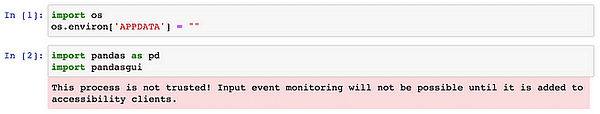
import os
os.environ['APPDATA'] = ""
Now you can import it without no errors. You might get a warning message which is okay. The reason for this warning is the missing implementation of some recommended interfaces in Mac OS, so the system gives this warning.
The last step is to load a dataset to use to demo the features of this library. You can load a structured dataset of your choice or you can use PandasGUI available dataset. In this article, we will use the Titanic dataset which comes packaged with the PandasGUI library.
from pandasgui.datasets import titanic
Now, we are ready to launch PandasGUI. Simply call the show() function as shown in the code below:
pandasgui.show(titanic)
Once these commands are executed, a new window will open to reveal your uploaded dataframe.
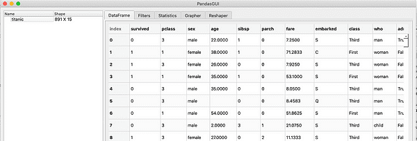
The Titanic Dataframe as shown by PandasGUI
PandasGUI Capabilities
The UI is pretty straightforward. It consists of the following components. I’ll introduce them in the later sub-sections.
- Viewing and sorting DataFrames
- Reshaping DataFrames
- DataFrame filtering
- Summary statistics
- Interactive plotting
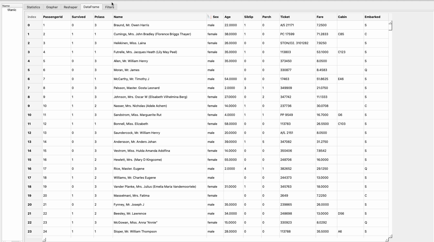
Viewing and sorting DataFrames
The first feature of PandasGPU is to view and sort DataFrames in both ascending and descending orders. This is an important step for data exploration and can be done easily as shown in the image below:

Viewing and sorting DataFrames
Reshaping DataFrames
PandasGUI provides two methods to reshape dataframes which are pivot and melts. The Pivot transforms dataframes by shifting values from one column to several columns. You can use it when you are trying to restructure your data by pivoting around a particular column. By specifying an index and columns for pivoting operations you can reshape your dataframe with greater ease.
On the other hand, the melt method enables you to unpivot your dataframe, combining multiple columns into a single one while maintaining others as variables. This feature is especially helpful when transitioning from wide-form to long-form or normalizing your dataset.
In the gif below we will use the pivot method to reshape the Titanic dataframe:

Reshaping dataframes using pivot
DataFrame filtering
On many occasions, you would like to filter your datasets based on certain conditions to further understand the data or to extract a certain slice out of your dataset. To apply filters on your data using PandasGUI first you will go to the filters section and write each filter and then apply it. Assume we would like to get only the passengers who are:
- Male
- Belong to Pclass 3
- Survived the shipwreck
- Age between 30 to 40
Therefore here are the four filters we will apply to our datasets:
- Sex == ‘male’
- Pclass == ‘3'
- Survived ==1
- 30 < Age < 40
In the gif below is a step-by-step guide on applying these four filters to the Titanic dataset:
Summary statistics
You can also use PandasGUI to provide a detailed statistical overview for the DataFrame. This will include the mean, std, min, and max of each column of the dataset.

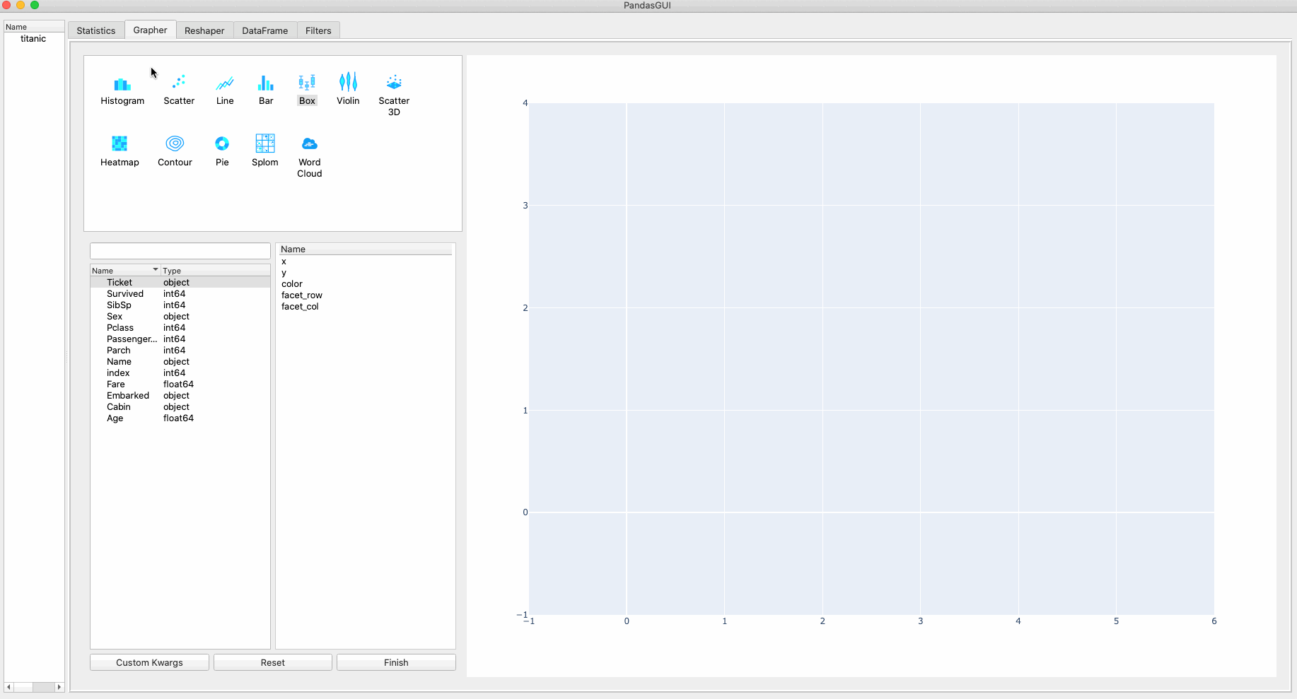
Interactive plotting
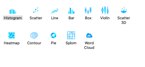
Finally, PandasGUI provides powerful interactive plotting options for your dataset which includes:
- Histogram
- Scatter plotting
- Line plotting
- Bar plotting
- Box plotting
- Violin plotting
- 3D scatter plotting
- Heatmap
- Contour plots
- Pie plots
- Splom plot
- Word cloud
In the gif below we will create three interactive for our dataset: a pie chart, bar plot, and word cloud.
This article highlights the features of PandasGUI a powerful library that adds a graphical user interface to the widely used Pandas library. We first demonstrated its installation, loaded a sample dataset, and explored features such as filtering, sorting, and statistical analysis.
References
- PandasGUI: Analyzing Pandas dataframes with a Graphical User Interface
- Everything You Need To Know About PandasGUI
- PandasGUI — The Ultimate Secret to Effortless Data Analysis
Youssef Rafaat is a computer vision researcher & data scientist. His research focuses on developing real-time computer vision algorithms for healthcare applications. He also worked as a data scientist for more than 3 years in the marketing, finance, and healthcare domain.